Showing posts with label thinking with your hands. Show all posts

Tuesday, March 22, 2022

Curious Goods Onionskin Journal, part 1

Over Christmas holidays I received a gift from one of my best friends Annelyn of Curious Goods. She's been making handmade journals since we were both frustrated art kids in academic school, and her latest experiment is the onionskin journal.


Onionskin paper was used for creating multiple typed documents with carbon paper, or for writing letters to send via airmail. It was even used in animation: "onionskinning" is the process of flipping sheets of animation roughs to check the smooth transitions between drawings. 


It's light, translucent, and sturdy, able to take even fountain pen ink without bleeding. Because of that, it's the ideal material for an art journal.


I can draw, write, paste, layer, and otherwise play with this journal as much as I want. I can fill the blank pages to the edge with scraps, sketches, and my thoughts.


I've even worked on it during an international flight!


My habit of writing backwards seems to suit this journal. Two columns of text suit the wider format, making it look more like a book. 


The backwards writing turns the words into just another design element, a textured background against the collage and drawings. Also, writing backwards makes me feel like everyone's ideal diarist and art hero, Leonardo da Vinci.


I love adding little movable elements like flaps of paper with illustrations or stickers underneath.


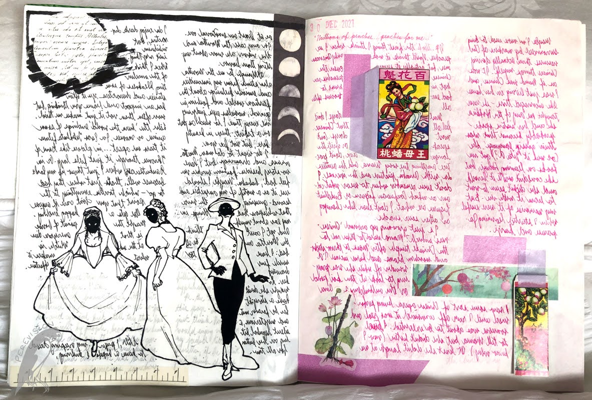
My collection of inks, fountain pens, stamps, stickers and washi tape is also put to good use. In fact, I printed out some of my own art on sticker paper to use in this journal.


As they fill up, the pages wear and wrinkle and gain weight. Flipping through the journal is a sensory joy, listening to the crinkle and savouring the feel of the paper.


I loved the journal so much I ordered some more. I'm looking forward to filling up these one hundred and ninety-two pages with my art, and many pages after that!


Tuesday, May 5, 2015

two great tastes

This past year I've been struggling with my art: I want to move up to the next level but I also want to have a regular job that I also enjoy, with a steady paycheck. So it's been less a work/life balance issue than a work A/work B/life balance issue.

I'm finally finding that balance, and a few days ago I got some very cheap but inspiring tools!


The Kuretake Brush Pen no.8 doesn't have the stellar reputation of its high-end sibling the no.40 (which has sable hair like a real paintbrush), or even the slightly more expensive no.13, but it's a great workhorse and I started using it right out of the box. A few sketches:


The second tool I got was pretty unexpected! Like lots of kid-friendly museums, my workplace sold spirograph sets, but we've stopped stocking them and I was able to grab the last unit for £2. I started using them and found them weirdly therapeutic.

Note for grammar nerds like me: it's (im)perfectly, not (I'm) perfectly.

The best results come from combining the two - the light tone and mechanical symmetry of the hypotrochoids plus the organic black line of the brush make an intriguing combination.


It's the marriage of science and art! Or maybe the marriage of mechanical art and intuitive art, which I also enjoy.

Sunday, June 15, 2014

doing the work: between 70% and 100%

I've been listening to Chris Oatley's ArtCast, and he talks about the difference between being 70% done and 100% done. In my own work I've been learning to tell whether I'm 'finished', or not.

A sub-optimal 'scan' from my camera phone.
Just because it's a concept sketch and not an animation cel, book illustration or comic book page, doesn't mean I shouldn't flesh it out as far as I can. I should always strive for the feeling I want to evoke from a certain scene. It may not be 'perfect' this time (next time it will! I vow to myself), but it should not be 'oh well, I guess that's ok'. It should be done.


Friday, June 6, 2014

we are tradition: kalinga woman

In the Cordillera Mountains in the Philippines, there are people called the Igorot, certain tribes of which traditionally wear tattoos all over their body. The art of this style of tattoo is dying; a woman called Whang Od, who lives in the tiny mountain village of Buscalan, is the last surviving fully-trained tattoo artist.


I learned a lot making this piece. I'm not quite where I really want to be with my art right now (to totally mangle a quote from Frank Herbert, the only true art of mankind is the art of discontent*), so I was happy to go back to something that required a lot of patience and craft. It was a slow start, and I made quite a few mistakes at first, but I got into 'the zone' after that.


One thing I did learn is that if you make a line with a Faber-Castell coloured brush pen and then immediately go over it with a Derwent Inktense watercolour pencil, you get a pretty amazing blending effect with a lot of richness and depth. But those pens dry really quickly, so you have to work fast and at the same time be patient: lay down a few lines, blend in, lay down a few lines, blend in.


I did the tattoos the same way I imagined them being done in real life: I rendered the bare skin first, then drew the tattoos in thickly with the coloured pencil, then went over it with the ink pen to make it solid and permanent.


The story came last. I got most of the information (as well as the photo reference) from travel blogs: here, and here, and here.

*the original quote goes like this (minus narration and contextual speech tics):
'Mankind has only one science.' 'And what is that?' 'The science of discontent.'

Tuesday, April 15, 2014

pens: Noodler's Nib Creaper flex pen

Originally I wanted an Ahab, but at $20-$24 each, it was definitely more expensive than the $14 standard flex, and since this was my first flex-nib fountain pen, I didn't feel comfortable spending that much.

What is a flex pen? It's a fountain pen with a flexible nib, which is designed to give you as much variation in line as a dip pen. Noodler's is especially famous for coming up with an affordable version that is also adjustable.

Here is the pen:


I will draw a veil over the slight struggle I had with the adjustable feed and piston-fill mechanism, and move on to how it writes (and draws!):
(No, I can't write in Elvish, why do you ask?)

Noodler's Heart of Darkness ink in Daler-Rowney cartridge journal,
Winsor & Newton artist's pan watercolours.

I'm very pleased with it. It looked a bit cheap in the seller's pictures but feels nice and solid in the hand. There is a strange smell at first, which the Fountain Pen Network says is normal for resin pens from India, but I'm not too bothered.

It's quite tricky to use right out of the box though (look it up on the forums for instructions on how to adjust it to your own style), but for me it's a small price to pay for a fountain pen that draws like a Mitchell copperplate nib!

Thursday, February 6, 2014

Noodler's doodles


Trying out different nibs with Noodler's Eternal Luxury Blue, a 'bulletproof' ink with a curious composition. So far it's best with Daler-Rowney Sketch, Cass Art Heavyweight Cartridge, and an old D-R 150gsm sketchbook of mine. This is D-R Heavyweight, at 220gsm, and the ink tends to feather and fade as it dries. An interesting effect, but better for doodles and sketches, not for planned projects like comics.

Sunday, August 11, 2013

pots & pans: cotman compact set


When I first arrived in the UK and was giddy with the high of being in London again after 5 long years HUZZAH, I may have staggered into the London Graphic Centre during a summer sale and bought a set of watercolours for less than £10.

The Winsor & Newton Cotman Compact Set is actually one of W&N's most downmarket colour sets. W&N is the everyman paint company, and Cotman is its budget brand for students.

Still, some of my best work was done with really cheap kids' paint--Golden was the cheapest, but Prang tempera is still one of my favourite art materials--so I was excited to give it a try.

Since I got this set I've used it pretty often, as you will have noticed in the past few posts. It's not as waxy as Prang but just as bright. It comes with 14 colour pans, but you can also buy individual colours. I swapped out 2 pans, because I am a little bit crazy about Prussian Blue and Payne's Grey and cannot conceive of leaving them out of any art set if I can possibly get them.


Because of the construction of the box, though, I can still pack the Chinese White and Pale Cadmium Red in the saucer that fits in the thumb space (seen here clipped to the side). I can even fit my mini Sakura Koi waterbrush (thanks, Mom! ♥) in the central groove, alongside the surprisingly usable synthetic brush that comes with the set.

One word of caution though: I had to fix the pans to the bottom of their trays with dabs of blu-tack, as they tend to pop out and spill everywhere and are a pain to sort out again. The paint blocks eventually stick to the trays with use, but I helped them along by wetting the bottom of the blocks and sticking them down, like votive candles. Otherwise, this is a really cute little box that is a pleasure to use!

Thursday, March 21, 2013

a kingdom by the sea

This isn't even the palace; this is just the magician's house.


Because I am not an architect, I have haphazardly mixed a bunch of different levels in one plan, based on the places where my characters will be spending the most time. (To be honest, I would like to see romantic leads spending more time in the kitchen, but I'm afraid I'm defeated by the write-what-you-know thing.)

Why is it that although I know nothing about architecture, I insist on doing these every time I want to do a comic? The answer is because the art needs to flow properly, and to achieve that I need to know where everything is, and get used to it. Also, I am obsessed with production design.

Some more 'setting' sketches:

(What is going on with that roof...?)

Sunday, March 17, 2013

page a day: villa


Pen and ink wash is both an exercise in completion and in restraint. You have to be careful about what you end up emphasising. In my mind the water was the focus of this picture, but my contrast control needs some work. Also I didn't use rulers or vanishing points, and I only started using pencil a third of the way through. It shows.

My advice? Unless you are an architect and can do this in your sleep, pencil your damn architecture in first. Even when using a reference.