Thursday, December 19, 2013

blast from future past: Treasure Planet

Treasure Planet was in 2002, for goodness' sake, and I still can't get over James Pleiades Hawkins and his 90s hairdo and ridiculous face.


I kind of want to draw his adventures at space academy. Scratch that, I really want to draw his adventures at space academy. He'd fall in with a lovable bunch of misfits, only a few humans but mostly alien races, and they'd get far better results than any of the legacy kids, and at the end of the third year there is an attempted pirate takeover and they foil it, and that's pretty much their graduation.

Yes, I have put too much thought into this. That's why it would be amazing.

Wednesday, December 11, 2013

moleskine sketches

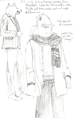
From some pictures I took of Bergdorf's windows when I was in NYC a few years ago.

A little sketch for the merboy story. It is driving me nuts that I still don't have a name for this thing.

Monday, December 2, 2013

the other green-eyed monster


Feeling frustrated this week. Collage journal.

Hulk from Jung-Geon Yoon's cover of Avengers World #2, cut out from Previews Magazine. No actual comics were harmed in the making of this image. Winsor & Newton inks and watercolours with Sharpie on a handmade paper journal my friend Jamie gave me.

Wednesday, October 30, 2013

merboy story, interior sketches


Some sketches for Fionn's house and his modifications. I didn't have any references on hand so had to work from memory. The rest of the house is based on Abbasid architecture but Fionn's room is more conventionally Medieval English.

Pencil with Neocolor II acquarelle crayons.

Thursday, October 24, 2013

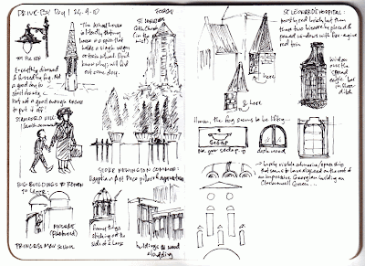
drive by sketches, day 4


I accidentally wrote 'day 3', because it was page 3 and I was distracted by trying to draw and write on the bus. Sigh.

This is actually 2 bus rides, because I was going to Trafalgar Square to meet my friends instead of to work. I had a little more time to draw the man with the cool 80s-futuristic hearing aids because he was sitting in front of me.

I got off at Trafalgar Square, but spotted the giraffe head and just had to draw it. The giraffe head is off of South Africa House (not Africa House, which is near Holborn). Yes, there is an elephant head next to it. I can't remember if the third head was a lion, but I would not be surprised.

Friday, October 18, 2013

all change, please

Breaking news: I have moved to a new, closer location for work and a more regular time. On the plus side, I can wake up later, come home earlier, and my bus ride is shorter. On the minus side it's now split into two, which means the drive by sketches will have to stop for now. I will get some colour into them in the meantime.

On the other other hand, I now have more time to do things like this:


Monday, October 14, 2013

drive by sketches, 2

Day 2 and 3 (which were, um, actually a few weeks ago).


I only posted it now because I decided to start adding colour to the entries. I think these would make some fun personalised postcards, although I need to clean them up and replace my wobbly bus handwriting.

Saturday, September 28, 2013

drive by sketches, 1

So I haven't posted for a month. This doesn't mean I haven't been drawing, just that I haven't been drawing for myself. I was getting a little frustrated, being busy with the new job and one or two projects that aren't going quite the way I wanted them to. And then I found this:


An Illustrated Journey: Inspiration from the Private Art Journals of Traveling Artists, Illustrators and Designers. This is a sequel to An Illustrated Life, a book of artists' journals, and I really wanted that...before I saw this.

I borrowed the book and have been reading through it the way I usually don't with these books. When I own them, I reach for them casually, flipping around pages, browsing and stopping wherever I want, hunting out favourite artists and ignoring others. I am going through this one like a proper book, reading from beginning to end, discovering artists and styles one by one.

I love travel journals and always wanted to do one, but have never had the time while I was travelling. Italy, Singapore, New York, all failures; I was enjoying myself too much rushing around to sit in one space and patiently commit it to memory. Looking at this set something loose in my resolve; I am now living in one of the most beautiful and famous cities in the world and not drawing any piece of it. In the end the frustration was too much. If the only travelling I do now is on my bus ride, then I will draw my bus ride.


So here it is: day 1 of the Drive By sketches. Begun on my best friend's birthday! Copic .01 micro liner in a Scout Books pocket notebook with a lemur on the cover, by artist Meg Hunt. I'll scan it for the next post.

Thursday, August 29, 2013

Book project, home stretch...

Guys, the book project is set to launch in January! This is not really a sneak preview, just a sideways glimpse of my favourite illustration of the bunch.


Pentel brush pen, Hunt 512 bowl nib with Noodler's Bulletproof Black. I have used this ink for nearly the whole book (plus other things) and after 100 or so drawings with washes, I have barely gotten past the shoulders of the 3oz bottle. Awesome.

Thursday, August 22, 2013

coffee: how do you take it?


'actually I feel like every day is coffee day' ... because it is.

Mitchell Copperplate nib (because I wanted to complicate my life), Jorg Hysek fountain pen ink. Note on this ink: it is not waterproof, and it smells like grade school paste. Regardless, I love it. I do wish I had a Jorg Hysek pen to put it in, though, because those things look like props for Star Trek.

Tuesday, August 20, 2013

visual notes

More sketchblogging from the square Moleskine.


The pillar-like thing on the bottom left is one of the water fountains that stood outside the villas in Il Borro, a resort in Tuscany.

Wednesday, August 14, 2013

The Bodhisattva of Action

This may be one of the most comic-book-like of the bodhisattvas I have drawn. May have something to do with the fact that I don't have my rubber stamps, and therefore my usual mixed-media approach necessarily has to change.

Skin colours laid down first.

With flash.

Without flash.
Based on the deity Zaou Gongen, a being with a rather mixed history. Instead of standing for aggression, the clenched fist represents emptiness, and therefore detachment. The flames represent inspiration, and the sword confidence.

Sunday, August 11, 2013

pots & pans: cotman compact set


When I first arrived in the UK and was giddy with the high of being in London again after 5 long years HUZZAH, I may have staggered into the London Graphic Centre during a summer sale and bought a set of watercolours for less than £10.

The Winsor & Newton Cotman Compact Set is actually one of W&N's most downmarket colour sets. W&N is the everyman paint company, and Cotman is its budget brand for students.

Still, some of my best work was done with really cheap kids' paint--Golden was the cheapest, but Prang tempera is still one of my favourite art materials--so I was excited to give it a try.

Since I got this set I've used it pretty often, as you will have noticed in the past few posts. It's not as waxy as Prang but just as bright. It comes with 14 colour pans, but you can also buy individual colours. I swapped out 2 pans, because I am a little bit crazy about Prussian Blue and Payne's Grey and cannot conceive of leaving them out of any art set if I can possibly get them.


Because of the construction of the box, though, I can still pack the Chinese White and Pale Cadmium Red in the saucer that fits in the thumb space (seen here clipped to the side). I can even fit my mini Sakura Koi waterbrush (thanks, Mom! ♥) in the central groove, alongside the surprisingly usable synthetic brush that comes with the set.

One word of caution though: I had to fix the pans to the bottom of their trays with dabs of blu-tack, as they tend to pop out and spill everywhere and are a pain to sort out again. The paint blocks eventually stick to the trays with use, but I helped them along by wetting the bottom of the blocks and sticking them down, like votive candles. Otherwise, this is a really cute little box that is a pleasure to use!

Saturday, August 10, 2013

locks and pens

This isn't exactly a page-a-day thing, but I have been a little caught up, and I would like to make time in my day to sketch regularly. I'll be posting my doodles here. My friend Jamie gave me a great Moleskine squared notebook, and it takes to dip pens very well (although, as always, I have to watch out for smears!)


Tried using a copperplate nib I picked up for 80p at the London Graphic Centre to draw a door lock from the Duomo in Florence. It's stiffer than the nibs that the oblique holder uses, so you really need to use pressure to get any variation. And because of the funny shape, my feel for the nib was off and one side of the lock ended up stretched out--a totally unforeseen effect!

Thursday, August 1, 2013

Writing blog!

I started a writing blog!

http://perechan.blogspot.com/

And here is the illustration I used for it, adapted from some work I did for HitREC:


Wednesday, July 31, 2013

oh look, another mermaid

Are you sick of fish ladies yet?

Actually you might know this one: I drew it ages and ages ago and have only just come back to colour it.


In the meantime this physical artwork (and the sketchbook it's in) has been in three different continents since I created it. It's the John Watson of watercolour art. Think of that as you look at it. You're welcome.

Wednesday, July 24, 2013

Inkscape inkspace

I don't think Inkscape is something I 'taught myself' so much as I just fell into it with a burning resentment because my computer can't handle Illustrator right now.

But I'm starting to feel my way around it a bit better, and there is nothing on earth anymore that YouTube won't show you how to do.

So a relative asked me to do some work for the banner header of their personal blog and they wanted an arrow with a pen nib point. 

Some sketches I did:


The designer came up with some pegs for me, to streamline the process. A dip pen point instead of the fountain pen, a burnished antique look.

This is the first thing I did off of one of the pegs from the designer: a Roman pen. She wanted it for the arrow shaft.


This is the final illustration:


Saturday, July 20, 2013

Fashion Sketches: Superdry Girls

It is literally unbelievably hot here in London (I'm not joking; people are going round saying they actually don't understand how this can be the same place as last year), and that means mini dresses. I keep looking at the adorable dresses on the Superdry website, even though I know I'm not going to buy them. And then this happened:

I actually did have a pet rabbit who looked like that, I don't know why I am so mean. Poor Sei-chan, at least you're alive and well and happily adopted.

(The stains are because I was painting in the garden, and then I took my teabag to put it in the compost and splash. I tried to make some drips so it would look deliberate, but that only made it worse.)

I thought 'well the higher classes seem well represented, what about merchants and workers'? I like the fishers and their nautical stripes. The textile merchant...everything looks fine except that wimple. You can't even tell that's what it is, her head just seems like a separate entity. Maybe it's her la-la-land expression.

So this exercise was more satisfying than actually shopping for Superdry, but not as satisfying as I thought it would be. Oh well.

Thursday, July 18, 2013

New banner header!

I was a little tired of doors (shocker!), and I thought the blog header looked untidy, so I made some banners from my dirigibles art.


I used a neat little free font called Stamping Nico that I got from dafont.com. Picked the third banner because it had a little more colour & variety. Hope you like it!

Friday, July 12, 2013

Happy Birthday, Mom!

It's my mother's birthday today, so I did her a watercolour! Unfortunately I have no scanner at the moment, so here is a photo instead.


Cotman pan colours on Daler Rowney watercolour paper, with Sakura Koi and Blue Heron waterbrushes.

(Edited 7/15/13 to replace the blurry photo with a clearer one.)

Saturday, June 29, 2013

spring cleaning

Working on something that's pretty old, but could do with a bit of cleaning up. I'd like to shop it around, if anyone would be interested in a rather depressing little book...


Now that I think of it, this is where I really started to explore working with dip pens. Now they're my favourite drawing tool.

Thursday, June 13, 2013

Sketches app

There is a new free drawing app for the iPad called Sketches. I downloaded it and it's great!


It has brush pen, felt tip marker and paintbrush as discrete tools. There's only one brush size for each unless you buy the Pro version (£1.49!), but the brush pen and technical pen make up for each other. It's quite sensitive, and you need to pick the option to undo via button because the 'backwards swipe' undo just makes a mark on your drawing. But I like it much more than Paper!

Tuesday, June 11, 2013

mysterious beasts

Look, I aten't dead!


Phoenix and unicorn, dip pen and Noodler's ink.

Sorry for the radio silence, been moving around a lot lately. Hope to post more stuff soon...

Monday, April 22, 2013

doors, part IDEK


Here are three things you can do while stuck in an interminable wait at the bank: 1) claw your own face off, 2) brood on your hatred for the world and everyone in it, 3) draw doors. Guess which one I went with.

In semi-related news, never bank at BPI if you can't draw, write or are otherwise not interested in spending 3 or more hours in a null space. BDO is far too efficient for creative expression.

I was at the bank from 10am to 3pm ffs NO YOU SAID YOU WOULDN'T THINK ABOUT IT

Sunday, April 14, 2013

WTF Richard II

So Hello_Tailor did a magnificent post of the Beeb's new Richard II starring Ben Whishaw as the flailiest drama king who ever did way too much drama and not enough kinging. Please check out her posts on the Hollow Crown series, they are amazing. The series itself is also amazing, as made evident by the beautiful Tom Hiddleston as Prince Hal.

Unfortunately I missed the first half hour of the film, and I was watching it with my grandmother, so it didn't occur to me to start tweeting it until I had to flee the TV room because I was laughing so hard at Richard's flouncy outfits. Here is a transcript of my tweets, with illustrations (my tweets are in white, hello_tailor's in grey):

Richard II is showing! My gran sent me out of the room for inappropriate giggling at each costume change, so y'know, thanks XD
needs more GOLD

it is not helping that I have your post open AS I WATCH
the floofy trailing sleeves, oh God. Also, Patrick Stewart's accent is delicious

I did forget to draw from time to time, because the movie for all its crackiness is incredibly well-acted and beautiful, and it was REALLY HARD to look away from the gorgeous trainwreck that is His Jesusishness Richard II.

Monday, April 8, 2013

hysterical romance: last look


A pervading issue I have with my work is that I often stop before I assess it properly. As a result my work frequently looks unfinished. I tried to add a little dimension here, and though I feel there could be more details added, that would only take the focus from the central figures. A raw, unpolished but finished work is different from one that just isn't done yet. And I think this is finally done.

Tuesday, March 26, 2013

merboy comic


 Fionn's house. He calls it the Castle, a word that comes from home. No one else where he lives uses it; they just call it the Magician's House. He doesn't get too many visitors.

My first attempt at a comics page. It's pretty hard to draw comics without guides! Luckily the Internet came to my rescue once again. I experimentally 'trimmed' my page myself, as my paper wasn't big enough to accommodate the full bleed.

I had a little trouble getting the brushwork to match the tone of the pen work at first, even though I'm using the same ink (Noodler's Eternal Luxury Blue). Also I think I should add a little land mass further back there over Fionn's right shoulder (no, his right, your left), with a glimpse of the town.

Almost done with my latest chapter of the Book Project, too! Very exciting!

Thursday, March 21, 2013

a kingdom by the sea

This isn't even the palace; this is just the magician's house.


Because I am not an architect, I have haphazardly mixed a bunch of different levels in one plan, based on the places where my characters will be spending the most time. (To be honest, I would like to see romantic leads spending more time in the kitchen, but I'm afraid I'm defeated by the write-what-you-know thing.)

Why is it that although I know nothing about architecture, I insist on doing these every time I want to do a comic? The answer is because the art needs to flow properly, and to achieve that I need to know where everything is, and get used to it. Also, I am obsessed with production design.

Some more 'setting' sketches:

(What is going on with that roof...?)

Sunday, March 17, 2013

page a day: villa


Pen and ink wash is both an exercise in completion and in restraint. You have to be careful about what you end up emphasising. In my mind the water was the focus of this picture, but my contrast control needs some work. Also I didn't use rulers or vanishing points, and I only started using pencil a third of the way through. It shows.

My advice? Unless you are an architect and can do this in your sleep, pencil your damn architecture in first. Even when using a reference.

Friday, March 15, 2013

page a day: water, water everywhere

I have a new dip pen! It was super cheap and it's very good with Noodler's Eternal Luxury Blue. Have some water gardens and a Roman bath to celebrate.

I am trying to keep my hand in with dip pens as the Book is entirely done in pen & ink with some washes, and I'm planning to make some comics in the same way. It's a good thing I'm moving back to where I can get heavy cartridge paper with relative ease again; it seems to be the best fit for this technique.

Thursday, March 14, 2013

page a day: calligraphy


Playing with Speedball nibs and pen ink. C0 & C4 broad tips, B5 round, orange Calligrapher's that I got in a Kate's Paperie warehouse sale and Noodler's Eternal Blue. I used a syringe to mix them on the second page and splashed them around a bit.

My work seems really halfhearted lately. I will step things up in coming weeks.